Designing the digital identity for an agency shaping urban development
Period
2025
Role
Web design, Visual direction
Client
Maak de Stad
(CHALLENGE)
Creating a fresh, bold digital identity for Maak de Stad
The website needed to feel energetic, confident, and approachable, moving away from the “middle-of-the-road” tone of traditional urban development platforms. It had to attract new talent, engage clients such as municipalities and developers, and build trust with the public by showing practical expertise while highlighting creativity. The design needed to reflect Maak de Stad’s core values—connecting, energy and boldness, craftsmanship, and delivering results—in a way that was clear, accessible, and visually distinctive.
(PROCESS)
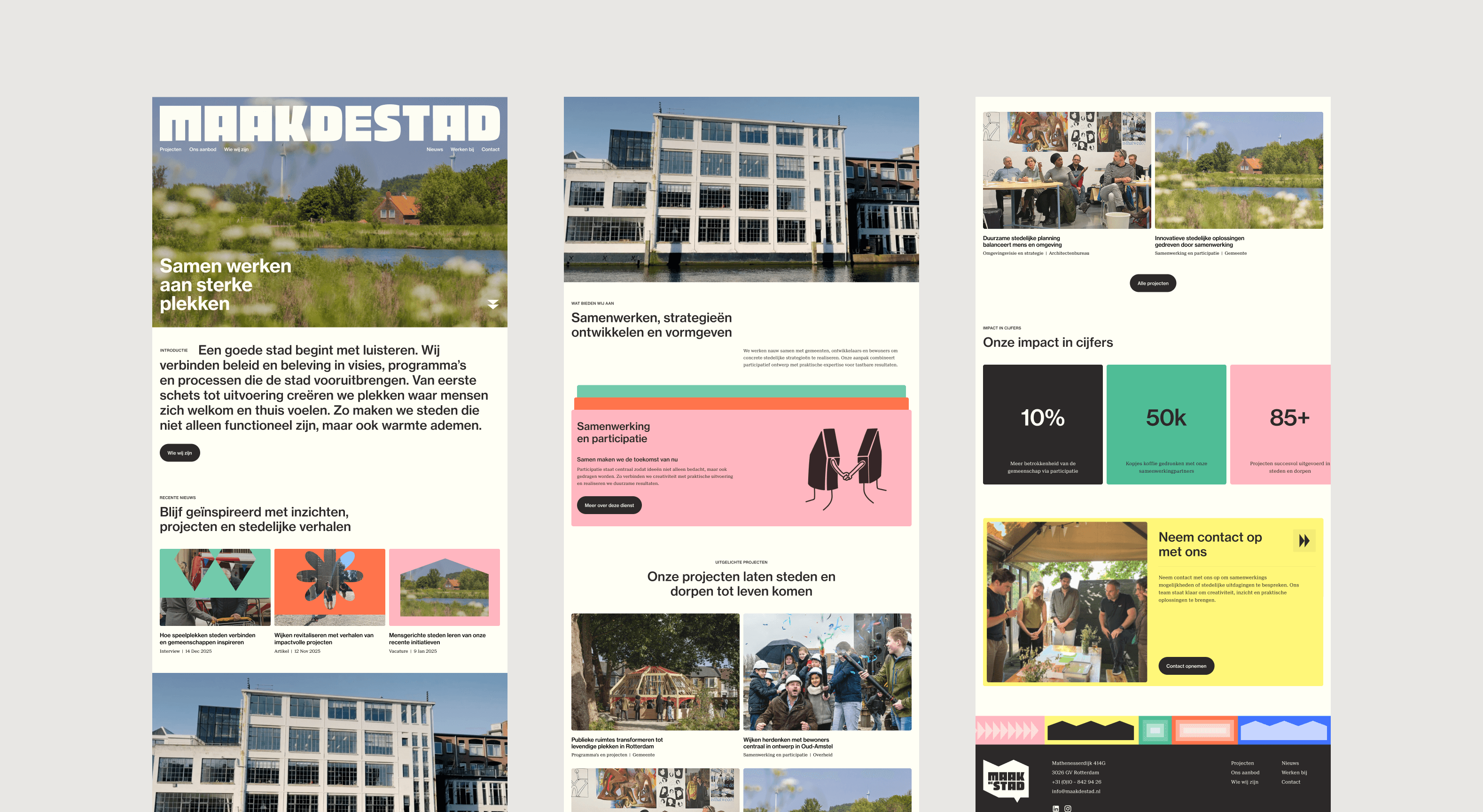
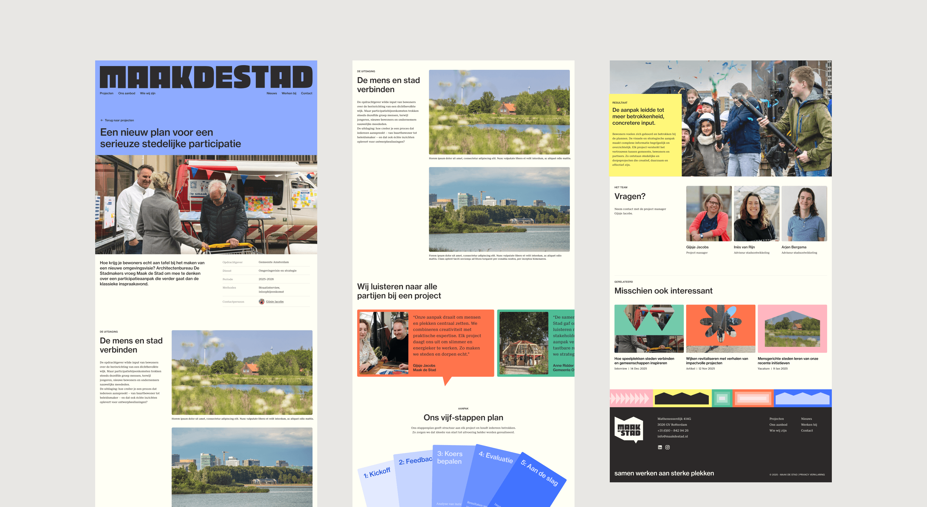
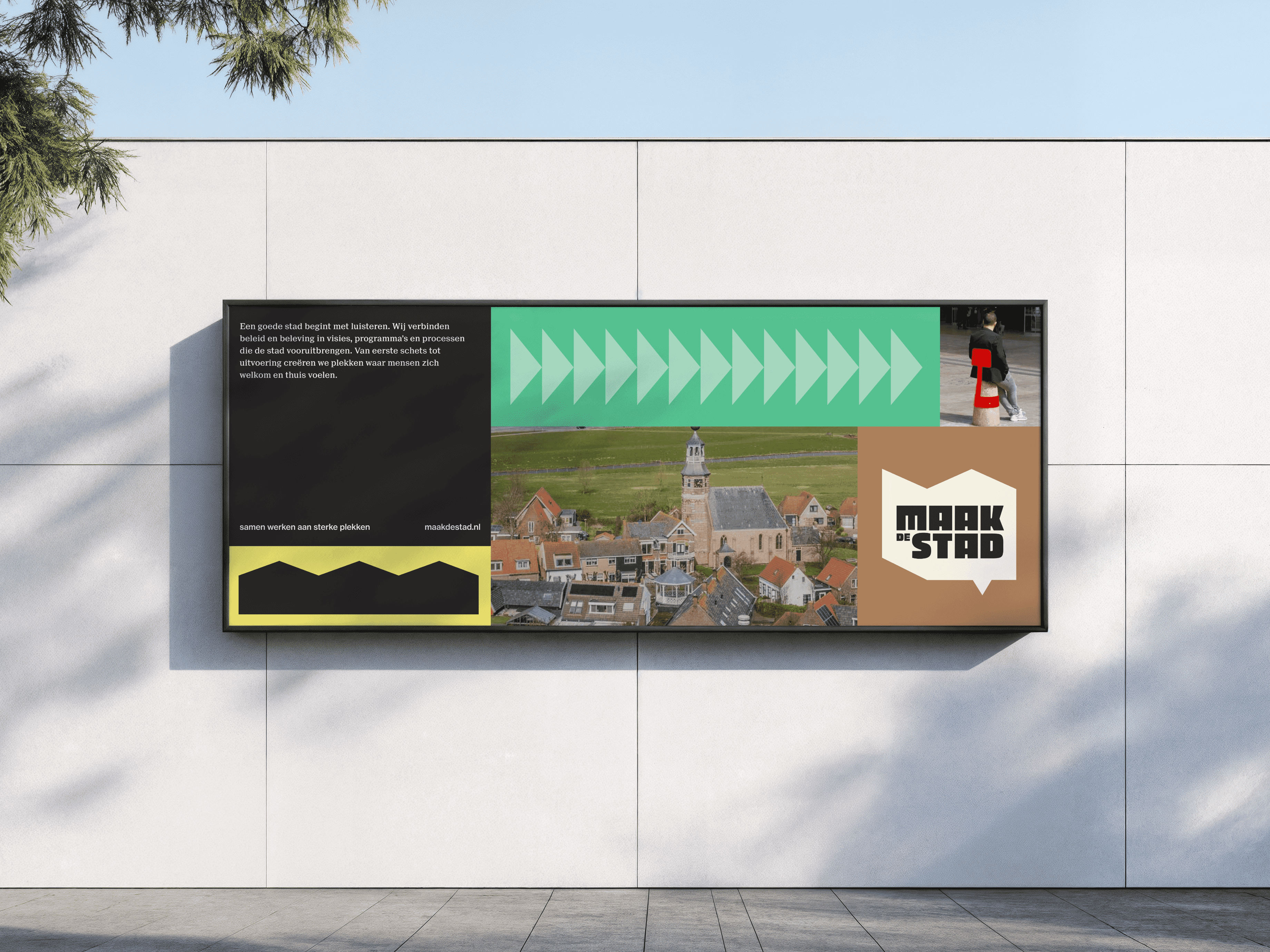
Translating brand energy into a cohesive digital system
Starting from the existing brand elements—colors, typography, and geometric forms—I translated the identity into a flexible web system that balanced professionalism with playful energy. I expanded the shape language for hovers, transitions, and footer elements, developed layouts and grids that guided the eye without overwhelming, and applied color and hierarchy consistently across sections. Photography and selective illustrations were used to highlight people and places, while subtle interactions and animations added rhythm and engagement without distracting from content.
(OUTCOME)
A distinctive, approachable platform for city-making
The final website presents Maak de Stad as distinctive, approachable, and credible. It communicates the team’s expertise, creativity, and hands-on approach while appealing to clients and prospective talent alike. The visual language, color system, and interactive elements work together to create a cohesive, dynamic platform that supports both practical content and the brand’s refreshed, bold identity.